
Swatt Miers Architects
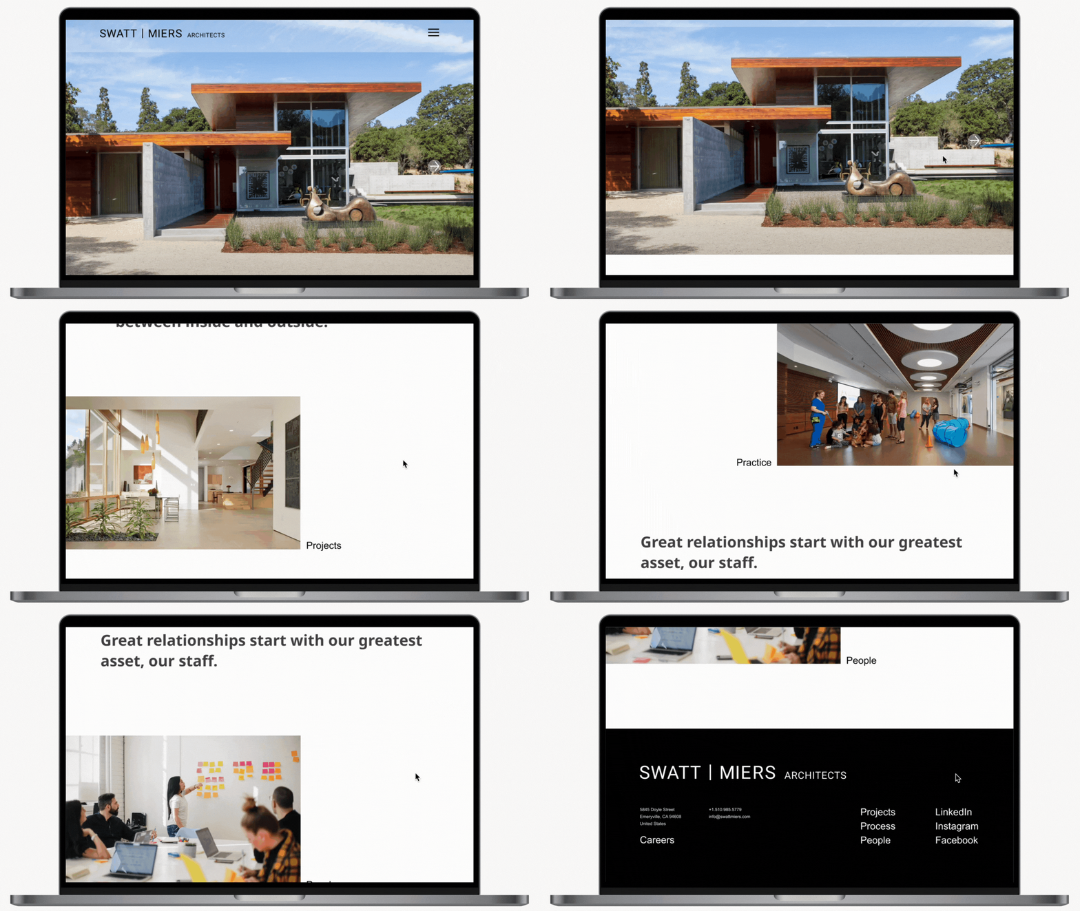
Simple portfolio website for architecture firm.
Role
end -to-end UX/UI Designer
Timeline/Deliverable
16 weeks/Web based prototype
Project Type
Student Project
Overview
Swatt Miers Architects (SMA) is an established architecture and design company known for California modern residences and a variety of civic and animal shelter projects.
Being a small business they need a flexible and easy website they can manage on their own to update projects and company news efficiently.
Research
Comparative Analysis
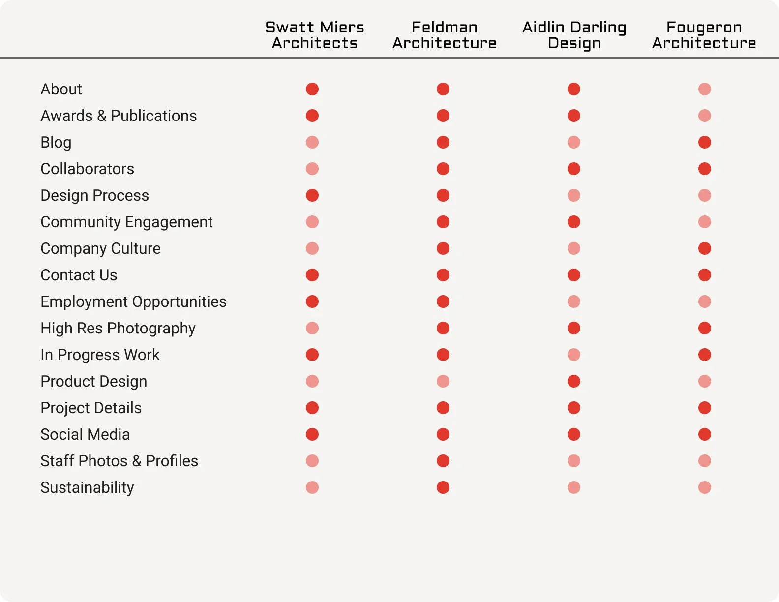
Research began with looking at SMA’s peers and competition in the industry.
What we found
As expected, all of the portfolio websites from other companies utilized large, high resolution images of their projects along with listing their accolades.
User Interviews
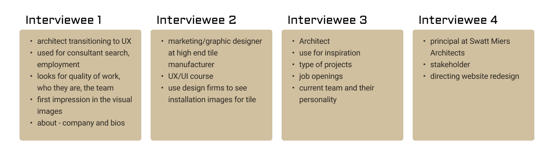
I also conducted user interviews through Google Meet at approximately 1 hour durations to analyze the current website design.
What we found
Too many projects and images are on the website.
Layout of certain pages need more refinement.
The website is modern but classic aesthetic.
The mix of high end residential and animal care facilities projects is confusing and feels out of place.
What’s the problem?
This long standing architecture company could use some simplification of their portfolio website. By creating consistencies in the layout and updating the design to stay current while being true to their formal design aesthetic, the company can use the website as a tool to better connect with the audience.
Since the “users” in this project are the in house website editors, simplifying the layout will also alleviate frustration when updating the content
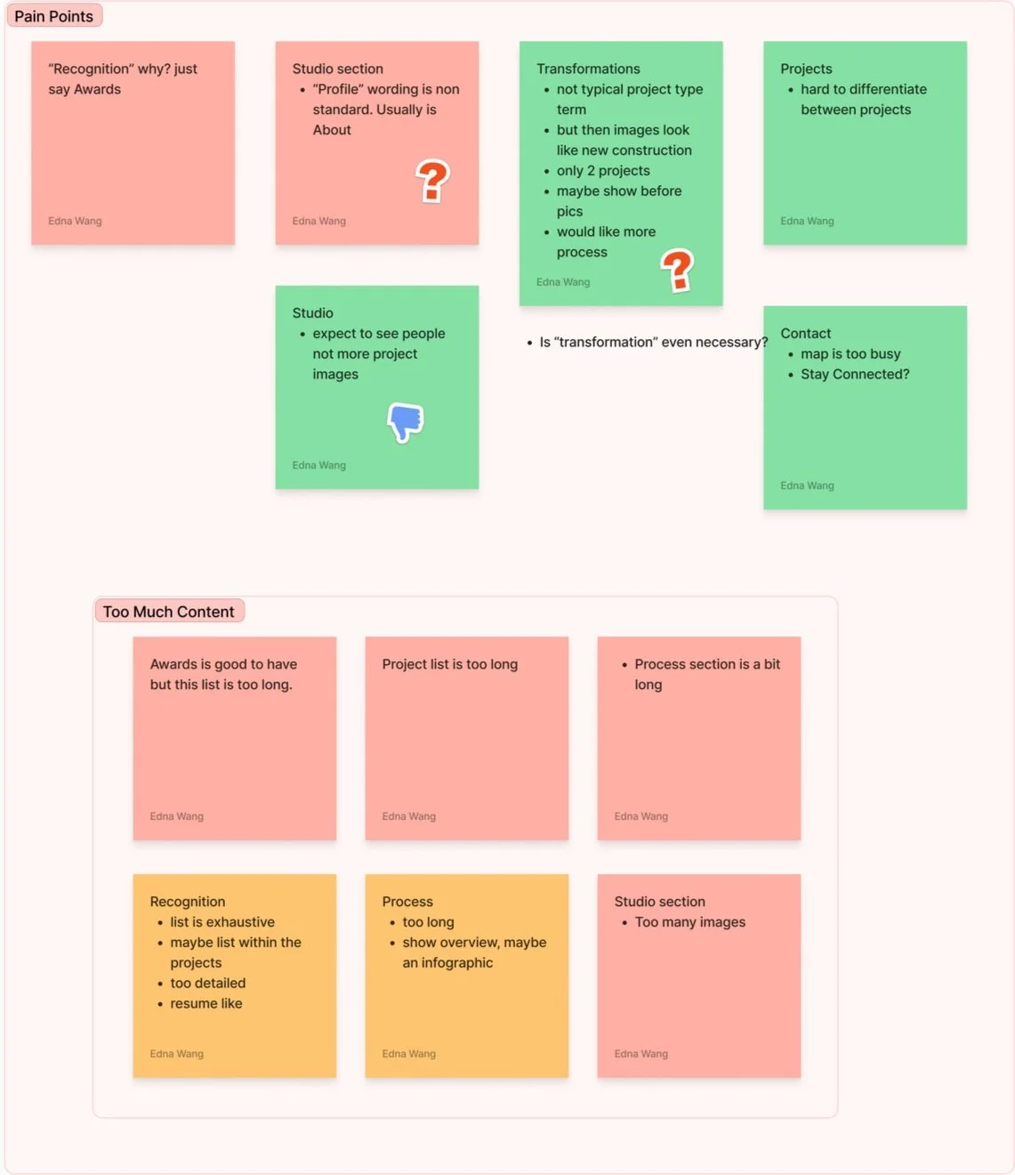
Affinity Map (link for full record)
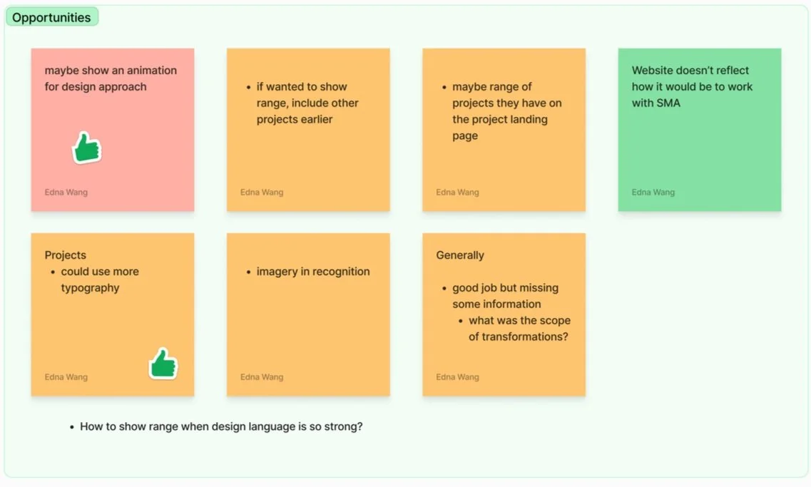
Affinity Map (link for full record)
What we found
Pain points:
Too much content:
Awards list is long and tedious
Projects listed is extensive
Process section doesn’t cater to the audience
Lack of hierarchy:
Awards, projects and general content doesn’t highlight any particular featured elements
Project images are very similar and is hard to differentiate
Uncommon word usage:
Use of word Transformation to describe renovations is uncommon to the industry and was a bit confusing to some interviewees
Use of word Profile vs About in typical website verbiage let to questions
Opportunities
Show a greater range of projects on the landing page
Highlighting projects to showcase current work
Update layouts for interest
Defining the User and the Problem
This is a straight-forward portfolio website that needs to provide 2 functions:
Be able to update easily for the first user, SMA
Provide a breadth of work to impress second users, potential clients and showcase the company’s design aesthetics
Information Architecture
I had assessed the existing information architecture to determine what is working and what could be modified. This is the sitemap for the product I developed to help define the scope and prioritize the necessary features.
New Sitemap
Design
I utilized competitors’ websites to hone down the baseline of information that an architectural portfolio website should include.
Based on user testing, I looked to utilize a few layout methods to help with the organization of the content.
Staggering the images help create a rhythm that is more dynamic and interesting. It also provides opportunity to includes wording, quotes, or a description in the in between spaces.
Along with staggering the images, including various sizes also help to highlight projects.
Overall, a purge of old and less relevant content helped to streamline the website.
Wireframes
I studied some quick wireframes to help visualize the final layout and establish the language for each portion of the site.
Low Fidelity Layout Studies
Low Fidelity Layout Studies
How success was measured:
Participants can move through the tasks without frustration.
Experience a simple, portfolio website that showcases the company’s work.
Results:
Participants generally thought the website was easy to use, but there were some comments that provided suggestions for improvement.
Based on the comments, the following iterations were made to update the design. Click on link to go to the Prototype.
Reflection
As I work with real people on a semi-realistic project, I understand the scope is not always to reinvent the wheel but to simplify a product that is useable.
Although some of the comments from user testing leaned towards the negative, I moved forward with certain initial designs because they aligned with the original intent, to provide a simple portfolio website for the client.
With more direction and content information, I would have liked to suggest a staff profile page with more personality.
View Other Projects
Designlab
Museum App